Wednesday, November 9, 2011

Le Corbusier's Five Points of Architecture

Les 5 Points d' une architecture nouvelle, which Le Corbusier finally formulated in 1926 included (1) the pilotis elevating the mass off the ground, (2) the free plan, achieved through the separation of the load-bearing columns from the walls subdividing the space, (3) the free facade, the corollary of the free plan in the vertical plane, (4) the long horizontal sliding window and finally (5) the roof garden, restoring, supposedly, the area of ground covered by the house.


Le Corbusier Comparative sketches to show the advantages of the 'Five Points'
above: Le Corbusier Comparative sketches to show the advantages of the 'Five Points'


These points were illustrated best in Le Corbusier's domestic architecture.
Le Corbusier's first attempt to deal with the problem of mass housing was Maisons Citrohan, designed in 1920-22. All parts of the house are united by a spatial continuum, while the open space created by the pilotis and the flat roof increase the otherwise small available area. The prototype of a single-family unit, which was later modified to a module within a collective building, for example the basic units of the Immeuble-villa (1922).

Le Corbusier established his concept of the dwelling as standardized, mass produced and serviceable like the modern car. Citrohan 2 implies the elements of the Dom-Ino constructural system, that is the use of a reinforced concrete frame. Citrohan 2 introduced ideas of Le Corbusier's '5 Points of New Architecture': the building raised off the ground on pilotis, which 'free' the ground for vehicular circulation and for services. The roof-garden or terrace, which is clearly established in the Citrohan projects as a component of private, domestic space.


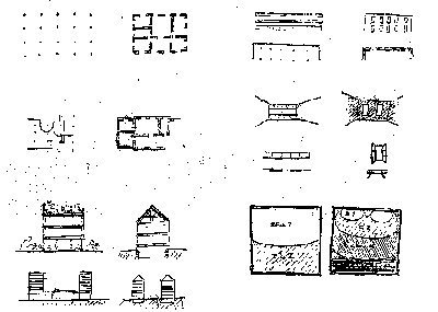
Four Studies of the potentials of the 'Five Points'
above: Four Studies of the potentials of the 'Five Points', 1929.

(a) Maison La Roche-Jeanneret, (b) Villa Stein, (c) Villa at Carthage, (d) Villa Savoye


The Cook House or Maison Cook in Boulogne-sur-Seine (1926) was a terrace house, an almost perfect prototype for a small, single-family urban dwelling, employed several of Le Corbusier's ideas. The ground floor was almost entirely open; which contained parking space for a car, a small-enclosed entry and stair hall, and a paved and planted open terrace. The upper floors were supported on a few concrete pilotis.

As at Citrohan, the living room extended upward through two storeys, and a portion of the roof used as a spacious garden terrace. Also, special in the Maison Cook was the extremely free handling of partitions. On every floor level Le Corbusier made a point of curving his partitions to make it quite clear that they were entirely independent of all structural supports.

Having assured himself of the 'Five Points' in the design of the Maison Cook, Le Corbusier was about to explore further possibilities of the system. The sytem led to practical advantages as well as spatial and formal flexibility. The Villa Stein which Le Corbusier built at Garches during 1927. Again, pilotis supporting a part of the ground floor; a hollowed-out, two storey outdoor cube; freely curved partitions on every floor; a 'Golden Section' system of facade design; and a roof garden on top. The villa was another contribution towards Le Corbusier's central objective - to create prototypes for a vertical city. Villa Stein possessed a sculptured stairs and suspended entrance canopies, the long, uninterrupted ribbon windows. Also, both its short end walls are blank, or almost blank, as Garches was designed again as a unit in a repetitive block of 'superimposed villas'.

The 2 Houses Le Corbusier built at Weissenhof Siedlung in Stuttgart (1927), were an experimental building to the modern suburb. Le Corbusier felt fully justified in making his Weissenhof buildings a kind of summary of all his convictions concerning an industrialized architecture.

The first Weissenhof building was a precise and beautifully proportioned version of his Citrohan project of 1922. It repeated the clearly defined roof garden on top, and free facade glazed by large rectangles of glass, like an abstract painting. The second building was an actual apartment house. The building had single-level apartments on the second floor, and a roof garden on top. The stair towers were treated as separate elements, projecting out from the 'pure prism' of the apartment block. A ribbon of glass consisting of horizontally sliding windows extended across the full length of the building. All partitions inside consisted of prefabricated storage walls, and all furniture, apart from chairs and tables, was built in also.

Villa Savoye was part of the central concept that Le Corbusier first developed in the Citrohan house in 1922. It revealed the same language traced as far as Villa Stein, but rearranged in a slightly different way. The villa at Poissy was also a realization of the 'five points'. As well as demonstrating these, it also has the characteristic elements such as the entrance ramp (which cuts through the middle of the grid), the curving walls of the solarium and, the pilotis and slab construction.
Once inside the ground floor, one can promenade through either by a ramp or a curving staircase. The first floor, surrounded entirely by a ribbon window, consisted of the complete lining accommodation wrapped in the open terrace. Light and air penetrated everywhere. Direct contact with the surrounding landscape is achieved by various openings, views are framed like a picture.

Sunday, June 29, 2008

Color Theory: Elements of Color

Chroma

As value controls our perception of light and volume, so chroma control defines their quality. Chroma, or intensity of hue alleviates the stress of viewing a world of pure hue. We use control of chroma to make our humble abodes more livable. Try to imagine sleeping in a room decorated in day-glow green. Chroma works hand in hand with value to portray surface quality, dimension and depth. It slows down the natural vibrations of pure hues and aids in the digestion of the beauty of color.

Conjure up your color tree for a moment. Visualize the leaves on the hue branch called red. Now look at you color wheel. We have painted it a highly intense red; the red that is the last leaf at the tip of our red branch. I have explained previously that as the leave sprout closer and closer to the tree's trunk, they progressively become duller, grayer less like red on our color wheel. But ,how does that happen? Not with magic, I assure you. It occurs naturally in some colors and through manipulation with others.

To manipulate a highly intense red, we can add the color that lays directly across the color wheel, namely green. When combined together, they become a tertiary or gray. This is indeed another function of our color wheel, in that it enables us to quickly identify any hue's chromatic opposite i.e. blue/orange, yellow/violet, etc. To this end, there exists a perceptual phenomena called Successive Contrast. If one stares at an intense red for about thirty seconds then looks at a piece of white paper, the chromatic opposite will appear as an after-image.

Another method in manipulating chroma is to add black or white to the hue. This time we are also altering the value of the hue, although this may not become apparent until a combination of black + white is added to the hue. This method illustrates how value and chroma work hand in hand in color harmonies.

Two final alternatives in manipulating hue remain. They are achieved by mixing a hue living next door to our chosen hue (need to use your color wheel again) or a hue from the same color family that is naturally duller by adding a choice from a group of toners called the earth colors. The latter receive their descriptive name from the fact that the pigments come from soil.

Color Theory: The Value Scale

The Value Scale

Perceiving Values

Identifying values can be a horrifying experience when working with hues. A comfort level can be attained by working with a gray scale and performing various exercises to reinforce your perception of the scales.


The importance of using value comes into play when one wishes to express an object's volume in relationship to the two-dimensional surface it lays upon. When viewing a black and white photograph, the viewer is able to determine the roundness of a teapot or the sharpness of the edges of a baby's block by the gradation of tonal values. Value tells our eyes if any particular part of an object's surface is in lightness or darkness. When the gradations of values from light to dark are slow and smooth in traveling across an object our brains perceived that form as a sphere, cone, cylinder or block. When the change in value is abrupt, we perceive the object as a cube.

Tonal quality of value also describes the atmosphere surrounding any particular object therefore affecting us emotionally, perhaps by triggering memories of past experience. In respect to perspective, value also describes distance. Think how value might also describe surface textures.

Perhaps most importantly, value control enables the artist to achieve harmony. Manipulating and choreographing value changes in the HUES we are using on our palettes not only describes form and volume, distance and atmosphere, but guides our eyes in traveling through a still -life or stroke piece with rest stops along the way for reflections and relevations!

Your exercises:

1. You can make yourself a grayscale using ColorAid papers in the grayscale selections of their package. These are papers that use paint as opposed to being printed with inks. The paper assortments are available in fine art stores, and at University bookstores.
2. Paint a wooden ruler my mixing your own grayscale from Black and White acrylic paints.

The Old Masters often started a painting with an underpainting of values. This technique is called a Grisalille. This exercise can be performed as a finished pencil drawing, which I employ when mapping my CDA and MDA board studies.

Color Theory: The Color Wheel

The Color Wheel

At this point, I had originally planned to review the color systems of Goethe, Ostwald,Itten, Chevreul, and Munsell. However, in the interest of avoiding the noisome sounds of snoring, I reluctantly edited the paragraphs out. You may wish to study them on your own someday.

So...back to the subject of this chapter. The definition of a color wheel could be: "a visual representation of standardized hues." Another definition could read: "3 primaries with 9 colors spaced in-between going around in a circle." I think the latter definition sums it up pretty well. A color wheel is not mystical, it does not impart secrets not known to mankind heretofore. It is a tool for using the knowledge we have and a standard method of communicating. It can be a very personal too., in that you may choose the red, blue and yellow that means RED, BLUE and YELLOW to you, or it can be a tool that you purchase from the art store. Whichever you choose, it remains a tool, an artist's device for visualizing the natural progression of hues from one to another and determining natural harmonies in combining them together in your art.

The color wheel illustrates hues at their highest chroma or intensity. For most students, this can be a drawback in that it is difficult to envision these hues in different values and chromas when using it as an aid to determine color harmonies. How do you solve this dilemma which didn't even exist until I mentioned it? Answer: make more than one color wheel. There will be exercises to teach you the effects of color mixing and visualizing chromas and values.
Three Primaries and Nine Colors Spaced In-Between

As previously mentioned, we use a standardized 12-color wheel. Please keep in mind that this is a standard for communication. There are various theories which expound on color wheels containing as few as 6 colors to as many as 30 colors. The study of color will never cease throughout future histories, it remains purely theoretical. Some theories may prove out more consistently than other,however no one theory is the end-all, be-all of color study.

The color wheel consists of 12 colors which we call HUES. We begin with our three primaries of Red, Blue and Yellow. These colors are placed in an equidistant triangular format around the circle. Laying at the halfway mark between each primary are the secondary colors. They are derived by mixing two primaries together in an orderly fashion around the circle. The secondary colors are named Orange, Green, and Violet. On each side of the secondary colors lie the intermediary colors. They exist as a result of mixing a primary and secondary color together, again orderly traveling around the wheel. These colors are named Red-Orange, Yellow-Orange, Yellow_Green, Blue-Green, Blue-Violet, and Red-Violet. Thus arranged, you travel from Red, composed of the longest light rays smoothly traveling from hue to hue, arriving via violet and red-violet, which corresponds to light's shortest rays, at red.

Please make an important note at this time. The noun, intermediary, is sometimes interchanged with the noun, tertiary.This may lead to confusing conversation with other people who are studying or teaching color. Barb Watson uses them interchangeably in her color book. I have been schooled in the theory that tertiary is the mixing of two complementary colors, which we will discuss later. It is therefore helpful to discern your conversant's definition of the word tertiary to avoid the 'crazed-person' look.

Color Theory: Elements of Color

Hue, Value, Chroma
Elements of Color


Isn't it interesting how three little words: hue, value, and chroma, can instill so much fear into the heart of a decorative artist? That's why I printed them as BIG words. Everyone likes to use big words in their vocabulary; big words are often a measure of intelligence. So, let's all get intelligent!

To effectively study color, we must first understand what color is. We know scientifically that color is made of our visual perception of light rays. We verbally define color in terms of hue, value, and chroma. For our study of hue, value and chroma, I have chosen the theories of Albert H. Munsell partly because his system is straightforward and still in use world-wide, but mainly because David Jansen told me to study him AND understand his work.
Albert H. Munsell - A Little History

Albert H. Munsell was born in Boston, in 1858. He was an artist, not a philosopher, rocket scientist or poet. He studied art at the Massachusetts Normal Art School and at the Academie Julian in Paris. While in Paris he won a scholarship to study in Rome. When he returned to America, he lectured in color composition and artist anatomy at the Normal Art School until 1915.

In 1879, he became more interested in color and in 1898 created his Color Tree (based on a sphere). After perfecting his system, he lectured extensively in America and Europe until his death in 1918 at the age of sixty.

His color system has become world famous and is still used world-wide as the accepted standard of color notation. In 1918, a group of his friends found the Munsell Color company to carry on his work in Baltimore. Today, it is part of the Macbeth company located in New York, where they continue to provide standardization and specification of color for commercial industries throughout the world.


Munsell's Color Sphere

Munsell's color tree is based on a three-dimensional solid sphere. Through the axis of the sphere running South to North is the tree's trunk. At the South end is the color black, moving through the value system to White at the North, with a Value 5 gray at the equator. Surrounding the equator are the hues of color from the color wheel as we know it: Red, Yellow, Green, Blue, Purple and the half-way points of their mixtures of Yellow-Red, Green-Yellow, Blue-Green, Purple-Blue and Red-Purple.

As each of these hues move either towards black or white (value) they are placed at the appropriate latitude around the tree. Simultaneously, as the hues gradually disappear into gray, they fill in the solid core of the sphere. Similarly, as the color moves towards stronger hues, they are placed along the radius of the sphere in a measured distance called chroma.

To thoroughly understand Munsell's system, you must now change your mental image to a tree. The trunk is our value scale, the leaves along the branches are our chromatic (intensity) scale, and the tips of the branches become our hues.Munsell further refined his system by assigning each color a defined position based on a decimal numbering system. This notation always remains constant: Hue , beginning with Red; Value, beginning with Black, and finally chroma, noted from the tree trunk outwards.

With the Munsell Color System, no new color can be discovered where there will not be a position available and waiting. Understanding this system will enable you to understand color relationships with more ease.

Hue, Value and Chroma - Defined

At this point, most of you know that Hue is simply the name of the color we are identifying. In discussing color theory, however we do not label color as having the hue name of Williamsburg Blue, Lime green, or even Maroon. We identify color by the hue family is is derived from: i.e. maroon is a color in he Red area of a color wheel. Williamsburg Blue is found in the blue area, and Lime Green is found in the yellow-green area. When you label colors by their hues, there is no longer any leeway for misinterpretation. Munsell goes a step further in identifying a color position within a hue family by marking its position with a decimal numbering system. He has assigned the number 5 to the hues of Red, Yellow, Green and Blue. Between these hues lie your secondary hues with 10 always falling on a secondary hue. Review the chart below:


1 2 3 4


5


6 7 8 9


10


1 2 3 4


5


6 7 8 9


10


1 2 3 4


5


6 7 8 9


10


1 2 3 4


5


6 7 8 9


10


1 2 3 4


5


6 7 8 9


10


R
YR
Y
GY
G
BG
B
BP
P
RP


When identifying hue position on the color wheel, R would be noted as 5R. The notiation 6R would indicate a Red that is closer to 5R but moving towards Yellow.You will see these notations on every bottle of Liquitex® paint along with a visual chart that refers to the 12-color wheel.

Now, just to see if you are paying attention, let it be noted that Munsell's color wheel consists on only 10 hue divisions: Red, Yellow-Red, Yellow, Yellow-Green, Green, Blue-Green, Blue, Purple-Blue, Purple, Red-Purple. Now that I have your attention, we will continue to use a 12-color wheel when doing the exercises as most of us are accustomed to a 12 color format. Both systems are thoroughly compatible as we are not using Munsell's number identification, basing our observations on physical and visual identification.


Value

The distinction of value is probably a skill all of us have learned at this point. It is simply the act of determining the position of a color somewhere between Black and White. Be aware of the fact that an individuals's determination of value placement can be one-half to one step different from another individual's evaluation.

The value scale is divided into ten equal parts with Black in the number one position and White at the number 10 position. While hue indicates if a color is green or blue, value determines if that hue is light or dark.

Bring back to your mind our color tree. Visualize a tall tree banded in values starting with a black base and ending with a white tip. From this trunk, grow ten or twelve branches and "paint" the end of each branch a hue from your color wheel. Did you paint your lower branches blue and blue-purple moving up to yellow for the upper-most branch?? That's right, although the hues are placed at the tips of your branches, each hue is also assigned a value position. Looking at your color wheel, these values are quite obvious when compared with your value chart.

Munsell notates value position following the hue. This is not rocket-scientist material.. it is very straight forward. The color "Baby Blue" would be notated as 5B-8. A country blue might be notated as 5B-5 or 5B-4. This is pretty easy when you keep your tree picture in your mind's eye.


Chroma (aka Intensity)

Chroma is perhaps the hardest aspect of color to determine. It is a very important property of color and completes our mental color tree. Up to this point we have a nice tree appearing to be frozen in time during the winter season: we have no leaves!

Perhaps by mentally growing your tree's leaves the definition of chroma will make sense to you. Chroma is the measurement of a hues' strength. It relates to your value scale not vertically, but horizontally. This is often where confusion sets in. If we are determining how 'gray" a color is, are we not measuring it's value?? NO!!! Grow a leaf at the tip of you Red branch. It should look RED. This RED would be notated as 5R-5-10, It is RED at it's fullest vibrancy. The hue Red is a very high intensity color, and as we move inwards along our branch and grow new leaves, visualize the leaves moving closer to gray or a tertiary gray if it aids your visualization. A dull color is lower in chroma than a a bright color. A tint is higher in VALUE than a shade, but not necessarily higher in CHROMA.

Now with your tree fully clothed in leaves,you will have a simple mental picture of the three basic but very important elements of color. You have now combined these elements in measurable increments which is the basis of Munsell's system. Now, even as we produce separate charts of Hue, Value, and Chroma, you have your mental picture to tie them all together.. truly a tree of life!

Color Theory: History of the Color Wheel

Introduction to Color Theory

In the past many men have dedicated their lifetimes to the study of color. This dedication has given us the knowledge we have today. We will study the different aspects of color theory from the ideas of Itten, Munsell, Birren, Chevreul and others. The wealth of information gained from these men could possibly take our lifetimes to thoroughly digest, therefore I will touch mainly on those aspects that pertain to our love of Decorative Painting. The following pages are not only going to strengthen your technical painting skills, but will strengthen the beauty of your painting and sharpen your sense of color.

Color theory is based on both scientific research and personal observations. As most of you do not come from a scientific background, we will forgo that end of color theory. For your personal research, you may choose to do additional personal study by reading books written by the above-mentioned men. A bibliography is supplied for your reference. This reading is NOT a requirement.

The next pages will concentrate strictly on identifying hue, value and chroma. These three little words are the very heart of color theory. We will do many exercises and make reference charts which will become a permanent file to refer to throughout you painting career. Do not despair over thought of drudgery the word "exercises" conjures up. The act of doing helps to cement ideas and the visual images help to activate the memory and understand concepts. So... Let's get started!


History of the Color Wheel

In order to begin study of hue, value, and chroma, we must have a starting point. The most natural point is the color wheel. Who decided colors come in a wheel, why are their twelve colors in the wheel, why is there a specific order of sequence??? Answers below!

From classical Greek philosophers up until around 1660, the accepted theory of color esteemed that all colors were based upon the elements of fire, air, water, and earth, mixed with lightness and darkness. Even Leonardo da Vinci held to this theory.

There were no attempts at organizing colors until Sir Isaac Newton bent white light through a prism and discovered the spectrum of colors. He chose seven major colors to relate to the seven planets and seven musical notes of the diatonic scale: red (C), orange (D), yellow (E), green (F), blue (G), indigo (A), and violet (B). He then twisted this straight bank of the spectrum into history's first color wheel.

It was not until the middle 1700's that the primaries were finally discovered. J.C. LeBlon published a written treatise on the fundamental nature of the primaries which simply states these colors mixed together in prescribed orders made what we now call secondary colors.

About ten years later (ca.1766), Morris Harris, published the first color chart printed in full hue. This chart appears in the book The Natural System of Colors . It discusses the primitive colors (red,yellow, blue), the mediate colors (orange, green, purple), and compound colors (tertiaries). This is the point I mark as the true beginning of color theory.

From the 1800's on, there is a flurry of activity in the study of color. The men who took up the study of color come from varied backgrounds of scientists, philosophers, artists even poets. Goethe arranged his colors in both circles and triangles, Runge used both the triangle and a solid color sphere, Blanc arranged his colors in a six-pointed star. I will not bore and confuse you with details of the many different theories at this point, however, it is interesting reading if you have the time. The amount of history I have given up to this point is simply to illustrate how long it took man to develop a logical system for studying color and to show how varied the methods can be.

Tuesday, April 15, 2008

Style Guide: Country Kitchens (Part VIII)

Create a convincing "turn of the century" style kitchen using salvaged architectural elements and period reproductions like those featured here.


Before the homeowner undertook the year-long renovation of her early-1900's kitchen, she consulted books and periodicals, foraged through salvage companies for antique building elements appropriate to the late-Victorian era, and enlisted the expertise of Gordon B. Sax, an architectural designer specializing in the restoration of 18th- and 19th-century New England dwellings.

Using antique and reproduction building materials similar to those pictured here, you too can re-create a period-style kitchen. The original 10-foot-square kitchen was enlarged by expanding into a former back porch and mudroom. With the exception of a dishwasher and a new gas range modeled after a 1906 woodstove, all modern appliances were concealed in an adjacent pantry.


Honoring the spare layout of many turn-of-the-century kitchens, built-in cabinetry was kept to a minimum. Constructed of poplar, the custom cabinets are fitted with glass-front doors and reproduction hardware from The Renovator's Supply. Latex paint contributes a lustrous finish to the cabinetry walls and ceiling, as well as the new custom-milled window and door trim. A worn wooden chopping block serves as a work island.


The Gilford Surgeon's Scrub-Up Sink -- a deep, vitreous-china commercial sink produced today by Kohler for use in hospitals -- approximates the style of the period. It's outfitted with a vintage-style chrome faucet featuring porcelain handles and a mounted soap dish. The countertops are made of solid surfacing and suggest the look of soapstone.

A dado of white glazed ceramic tiles from Minton Hollins of England bolsters the kitchen's spotless appearance. To prevent the space from appearing too austere, a vintage window with colorful leaded-glass panes, purchased from a salvage company, was installed. New custom-milled maple flooring and rag rugs braided by the homeowner's father also add warmth. Brass lighting fixtures -- including the center ceiling lamp, culled from an old schoolhouse -- provide sparkle.

"The ceiling is fancier than originals would have been," admits Sax. "It resembles those embellishing Victorian parlors." The nine-foot ceiling features stamped-tin pieces from W.F. Norman Corp., which uses original dies dating to their 1892 founding.


While today's replicas capture the style of the period, they also offer the benefit of modern convenience, like the cast-iron cookstove that features such innovations as self-cleaning and convection ovens.

For information on companies offering vintage and period-style building materials, check out Kitchen Details.